1 | Introduction
2 | The Basic Process
3 | Image Processing Programs
4 | Artifacts
5 | Related Links
The Basic Process
Even though there are a wide variety of programs that you can use, the basic process of creating a color image from WISE data is always the same: Youll start with 3 black & white (also called grayscale) WISE images, adjust each one independently, assign them individual colors, and then finally combine them together into one multi-color image.
Step 1): Adjusting the individual grayscale images
Often times the freshly downloaded grayscale images will not look very good when you first open them. They might appear to be very dark, or maybe only the brightest stars will be seen, with no sign of any nebulosity or faint details. This happens for complex reasons, but can usually be fixed with a couple of techniques: A) applying a logarithmic stretch function, and B) adjusting the brightness and contrast.
A) Applying the logarithmic stretch function
Most image processing programs come with a function that allows you to logarithmically stretch an image. The explanation for how it works is quite involved, but just remember that its a very useful function to use when you want to bring out faint objects while still being able to detect subtle differences in the brighter objects. There are many types of stretch functions, but they vary from program to program we recommend the log stretch because its fairly universal and typically very effective.
B) Tweaking the brightness and contrast
Another way to bring out the best detail in each image is to adjust the brightness and contrast. These are standard options in all image processing programs. An excellent highly-recommended detailed explanation for what is happening to an image when you adjust the brightness and contrast (as well as image processing in general) can be found in this video tutorial (see Part 1: Images Are Data the tutorial uses GIMP software [
more info on GIMP below]). Often, a quick way to make an image look much better is to first apply the logarithmic stretch and then adjust the brightness and contrast.
Step 2) Assigning a single color to each grayscale image
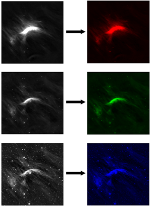
Most color images are made up of three main colors: red, green, and blue. In fact many professionals even refer to color images as RGB images. The general idea behind creating a color astronomical image is to assign one of these colors to each of your three grayscale images, and then add them together. In other words, one image will be red, one image will be green, and the other will be blue. An image that was once varying shades of gray (white to black) will become varying shades of red (red to black). The same goes for the green image (green to black) and the blue image (blue to black).
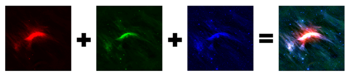
Step 3) Combining single-color images into one multi-color image
The next step is to add all 3 images together. Once combined theyll create one pretty color image that can show all of the colors of the full spectrum of the rainbow:
However, its important to note that astronomers typically dont randomly assign these 3 colors; they purposefully choose which grayscale image should be assigned to each color. The convention is that the longest wavelength image is assigned red, the middle wavelength green, and the shortest wavelength blue. For example, with WISE images, the W4 (22 micron wavelength) image will almost always be mapped to red, and the W1 (3.4 micron wavelength) image will typically be mapped to blue. That leaves the middle bands (either W2 or W3) being mapped to green.
You may be saying wait! theres 4 bands available from WISE but only 3 colors that we can assign? Well WISE was designed for science, not necessarily for pretty pictures, so it wants to provide as much data as it can. 4 bands are better than 3 after all. But a majority of image processing programs only want 3 images, because thats all you need to make a nice color picture. There are a few solutions to this dilemma:
- Discard either W1 or W2. These 2 shorter-wavelength bands often show very similar features to each other, so losing one of them doesnt mean youll be losing a lot of detail. Band 1 typically shows the least nebulosity (gas and dust) so it will typically be the one that gets thrown out, however it might be worth experimenting to see which you prefer. Bands 3 and 4 typically show the most nebulosity and detail, so youll probably want to keep them.
- Combine W1 & W2 together first. This extra step in the process involves averaging the band 1 and band 2 grayscale images to create one image, and then use that image as your blue image.
- If you have access to Adobe Photoshop (not free), there is a way to assign W2 the color cyan, and then add that color to the other 3. Youll also need FITS liberator in order to get Photoshop to recognize the FITS files. This is what the professionals do, but the process involves several extra steps that require a deeper understanding of how Photoshop works.
<< Previous | Next >>